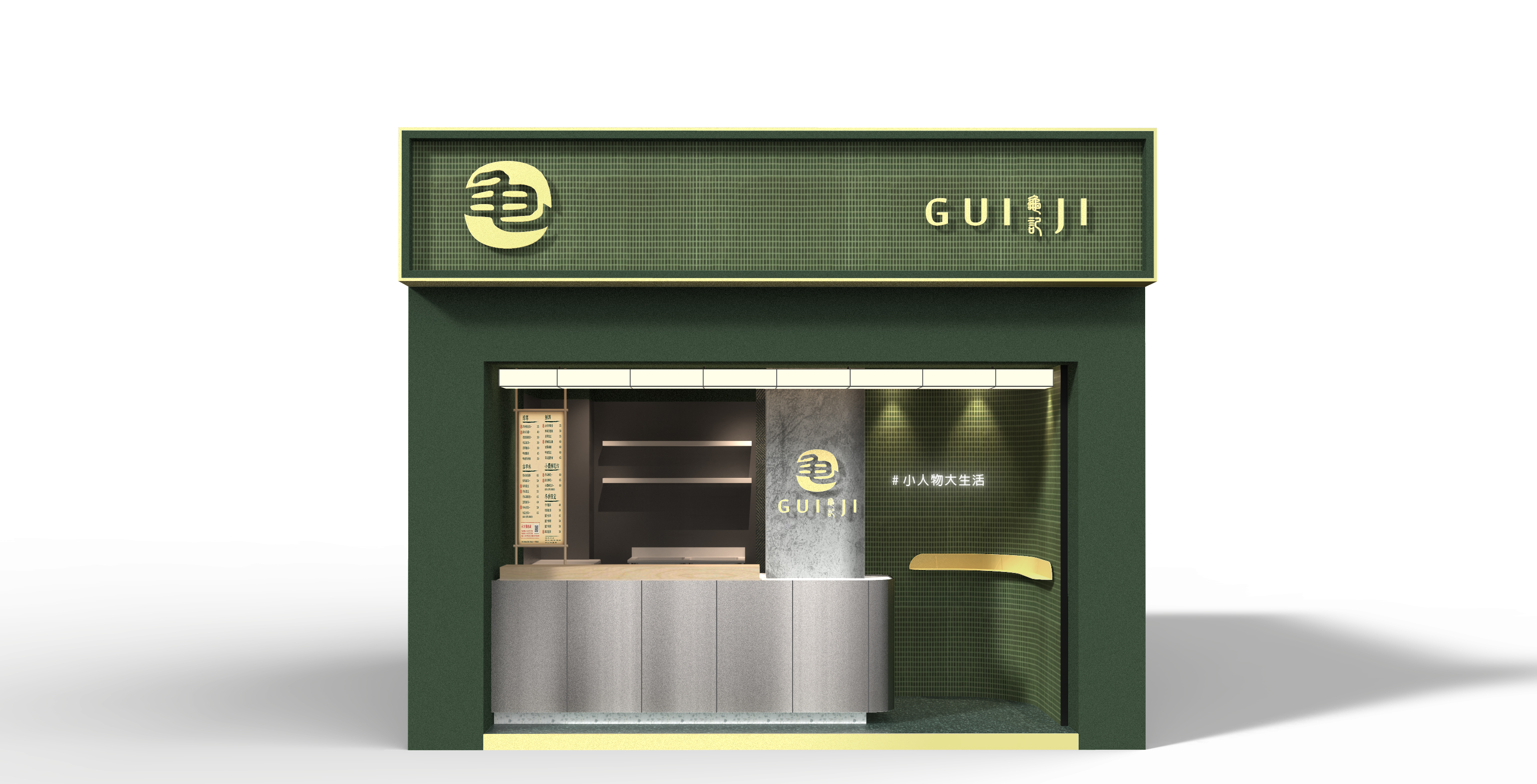
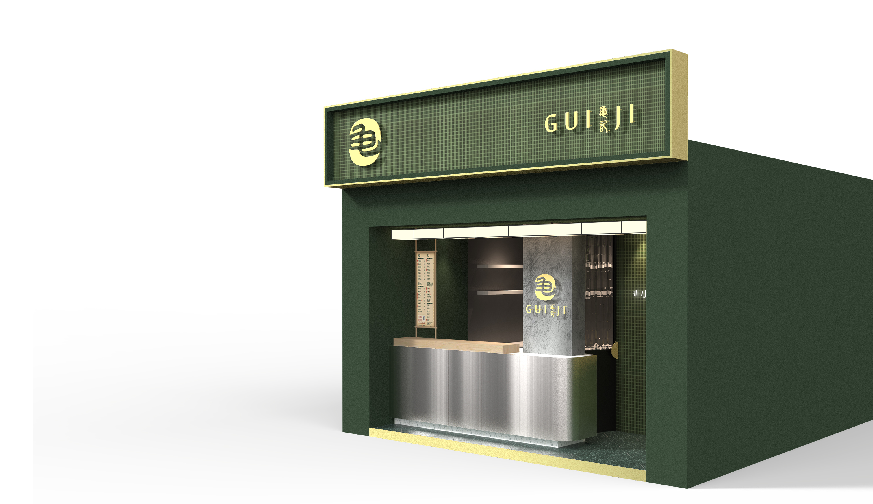
Guiji | 龜記茗品
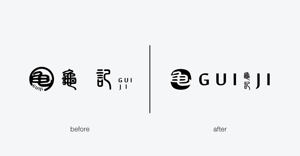
SAM BRANDESIGN has conducted a comprehensive brand image enhancement for GUIJI, a handcrafted beverage brand. The services provided include brand positioning, brand logo design, spatial planning, and packaging design for the beverages. Drawing inspiration from Taiwan in the 1980s, GUIJI aims to evoke nostalgic memories of buying candies with small change at the local store and translate it into the joy of modern professionals purchasing handcrafted beverages. The overall brand visual combines a sense of nostalgia with a contemporary touch. The brand logo simplifies repetitive information, with the Chinese name "龜記" adjusted to enable top-to-bottom reading and the English name "GUIJI" designed for left-to-right reading, creating a cohesive design.
SAM BRANDESIGN為『龜記茗品 - GUIJI』手搖飲品進行整體的品牌形象提升,服務內容包含品牌定位、品牌標誌、空間規劃設計及飲品相關包裝設計。龜記茗品 - GUIJI以臺灣八〇年代為時空發想背景,將小時候去『柑仔店』用零錢買蜜餞糖果的回憶,轉換到當代上班族買手搖飲料的幸福感上。整體的品牌視覺結合古早味與現代感,品牌標誌將重覆的資訊做簡化,依中文品名『龜記』調整由上而下的中文閱讀方式與英文品名『GUIJI』由左至右的英文閱讀方式成一體性的設計結合。
In terms of spatial visual planning, the deep green concept is retained, incorporating emerald green mosaic rectangular tiles to add a fresh and nostalgic touch to the walls. The terrazzo flooring reflects the simplicity of life in Taiwan's past, combined with other materials such as concrete, wood, brass, and textured stainless steel to enhance the overall visual experience.
空間視覺規劃上,延續原本的深綠色概念,設計使用祖母綠馬賽克長方磁磚增加古早清新的牆面細節,磨石地面呈現臺灣過去的生活樸實,並結合其他材質如水泥、木頭、黃銅、亂紋不鏽鋼等提升整體視覺感受。

"SAM BRANDESIGN團隊為我們品牌提供了卓越的想法與支持,幫助我們重新塑造品牌形象。他們專業聆聽我們的需求,理解我們對品牌的想法,最終為我們設計了獨具代表性的CIS方案,在此推薦給新創公司或需要重新塑造品牌形象的企業們,謝謝"
- 龜記茗品 -