Island Home | 島厝
SAM BRANDESIGN provided brand design services for Island Home, a Japanese-style yakitori izakaya in Taiwan. The main focus of the brand design services was the creation of a brand logo. Island Home embraces the culinary culture of Japanese izakayas.
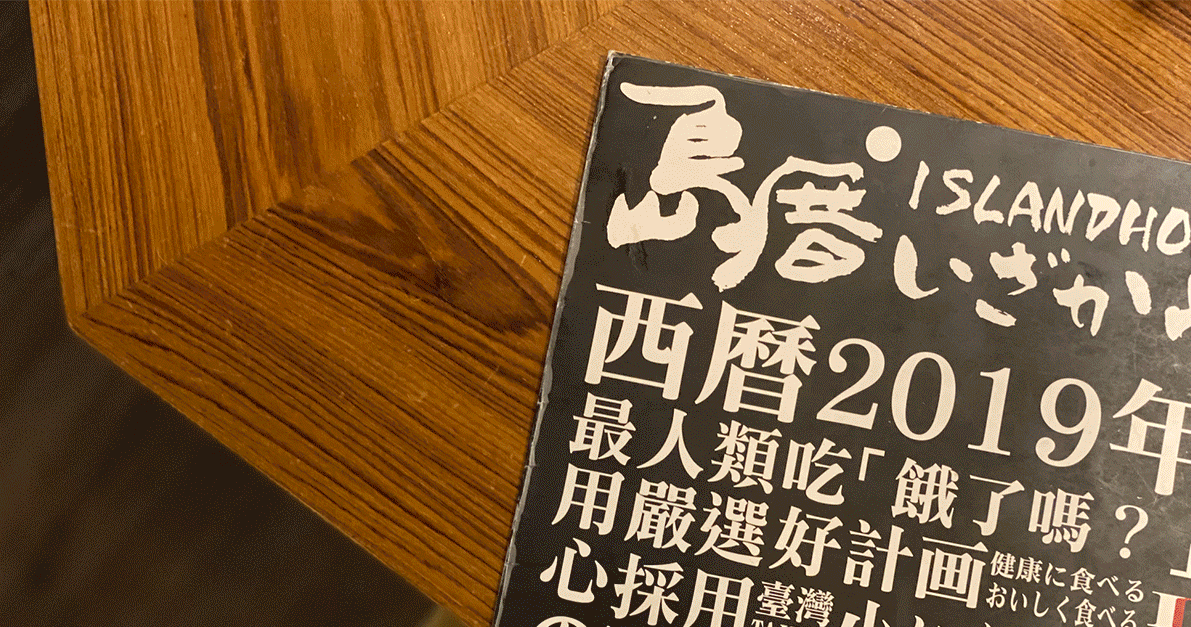
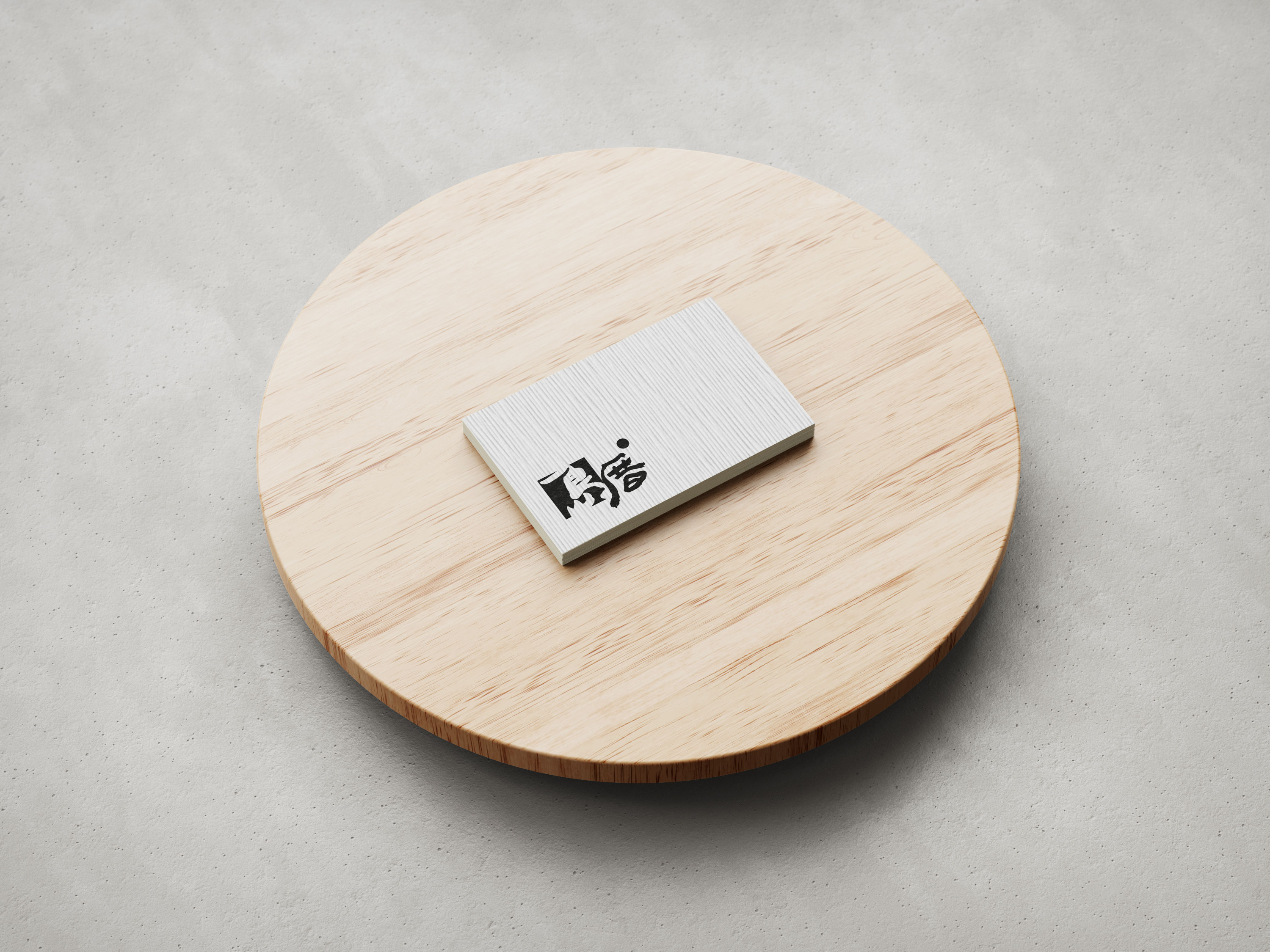
The name "島厝" is a play on words in Taiwanese, which sounds similar to "到家" (arriving home). "島" represents our beautiful homeland, Taiwan, while "厝" represents our warm home. The brand logo is based on calligraphy written by the head of the household, with adjustments made to the positioning. A red dot, symbolizing Japanese culture, is placed in the upper right corner of the logo. Finally, a square lattice pattern covers the entire Taiwan island, using a gradient of blue and green to represent the mountains and waters.
SAM BRANDESIGN為臺灣的『島厝 - Island Home』日式串燒居酒屋進行品牌設計服務,其中品牌設計服務內容以品牌標誌設計為主。島厝 - Island Home承襲日式居酒屋餐食文化的品牌。
『島厝』取自於臺語諧音『到家』; 島是指我們美麗的家鄉臺灣,厝是我們溫暖的家。品牌標誌以其家父所寫的書法字為基礎,做上下位置的調整,並於標誌右上方設置一個紅圓點象徵日式文化,最後以方形簍空方式,以有山有水的藍綠漸層涵蓋整個臺灣島嶼。
“悉心設計,有效傳達品牌意念!給SAMBRANDESIGN一個讚,合作過程也非常愉悅,整體思路清晰,清楚明瞭客戶所需,如果在品牌設計方面真的是專家!”
- 島厝 -