Keelung City Branding | 基隆城市品牌
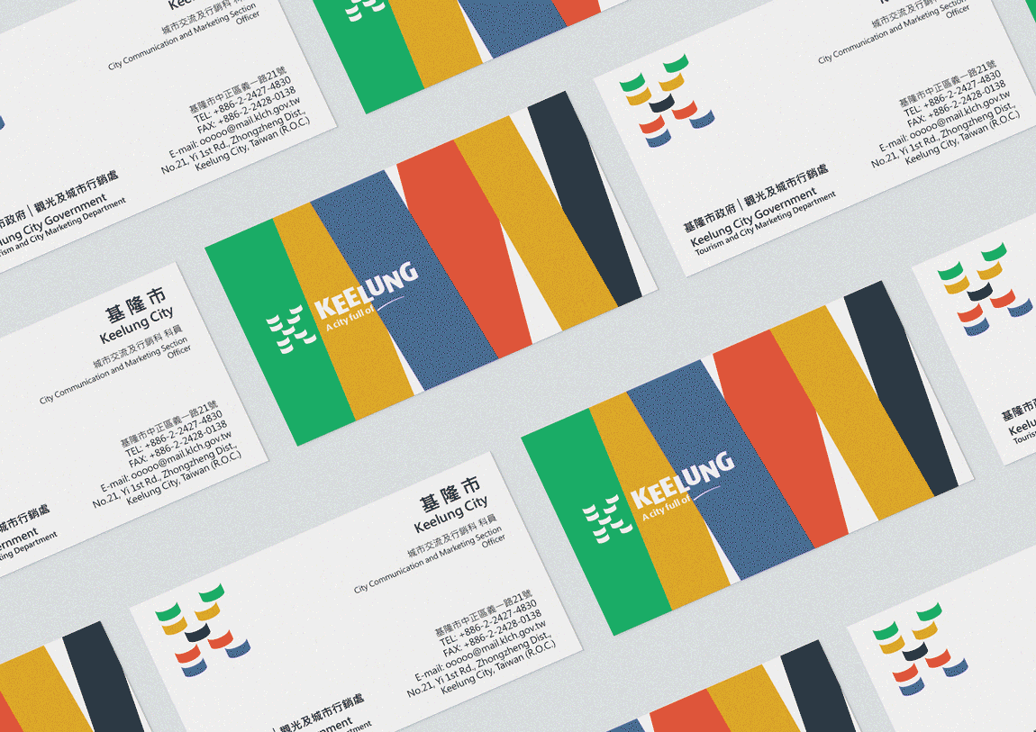
SAM BRANDESIGN is responsible for city brand design in Keelung, Taiwan. The design includes the Keelung city brand logo, Keelung city brand slogan, Keelung city brand usage guidelines manual, Keelung city brand graphic elements, Keelung city brand buses, and other applications. The concept of the city logo design is based on the letter "K," the initial of Keelung in English. It combines nine smiling wave elements and five color combinations. The lush green represents the mountainous city, the golden yellow represents the morning sun, the ink black represents the coal mines, the warm red represents vitality, and the deep blue represents Keelung's unique deep-water harbor. The overall design is bright and vibrant, reflecting the richness of Keelung's natural landscape and cultural history, as well as the city's diverse development characteristics.
SAM BRANDESIGN為臺灣基隆市進行城市品牌設計,其設計內容包含基隆城市品牌標誌、基隆城市品牌標語、基隆城市品牌使用標準規範手冊、基隆城市品牌輔助圖形、基隆城市品牌公車等其它應用設計。城市標誌設計概念以基隆英文Keelung字首的K字母為主體,運用九個微笑浪花元素圖形組合,搭配五個顏色組合,翠綠象徵山城,金黃象徵朝陽,墨黑象徵碳礦,暖紅象徵活力,湛藍象徵基隆獨有的深水海港。整體設計明亮、有活力,而活力是來自基隆豐厚的自然景觀、人文歷史,同時也表現出基隆市多元發展的城市特色。
The tagline "A city full of ____" allows everyone to define what kind of city Keelung is, embodying infinite possibilities.
標誌標語『A city full of ____』,基隆是個什麼樣的城市,由大家一起來定義,蘊含著無限可能。