Toplus | 托柏斯
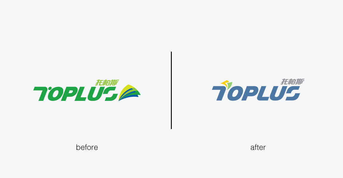
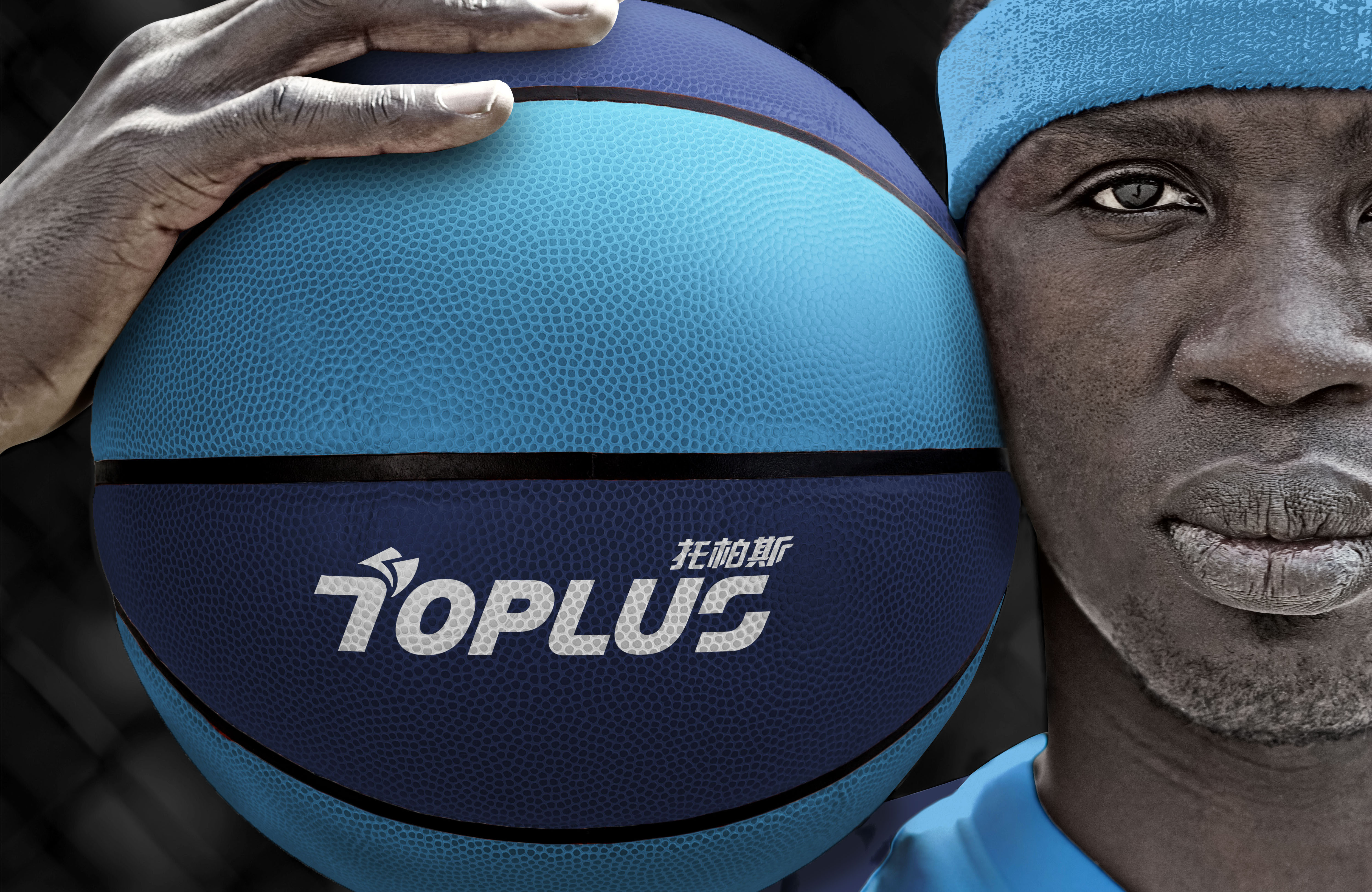
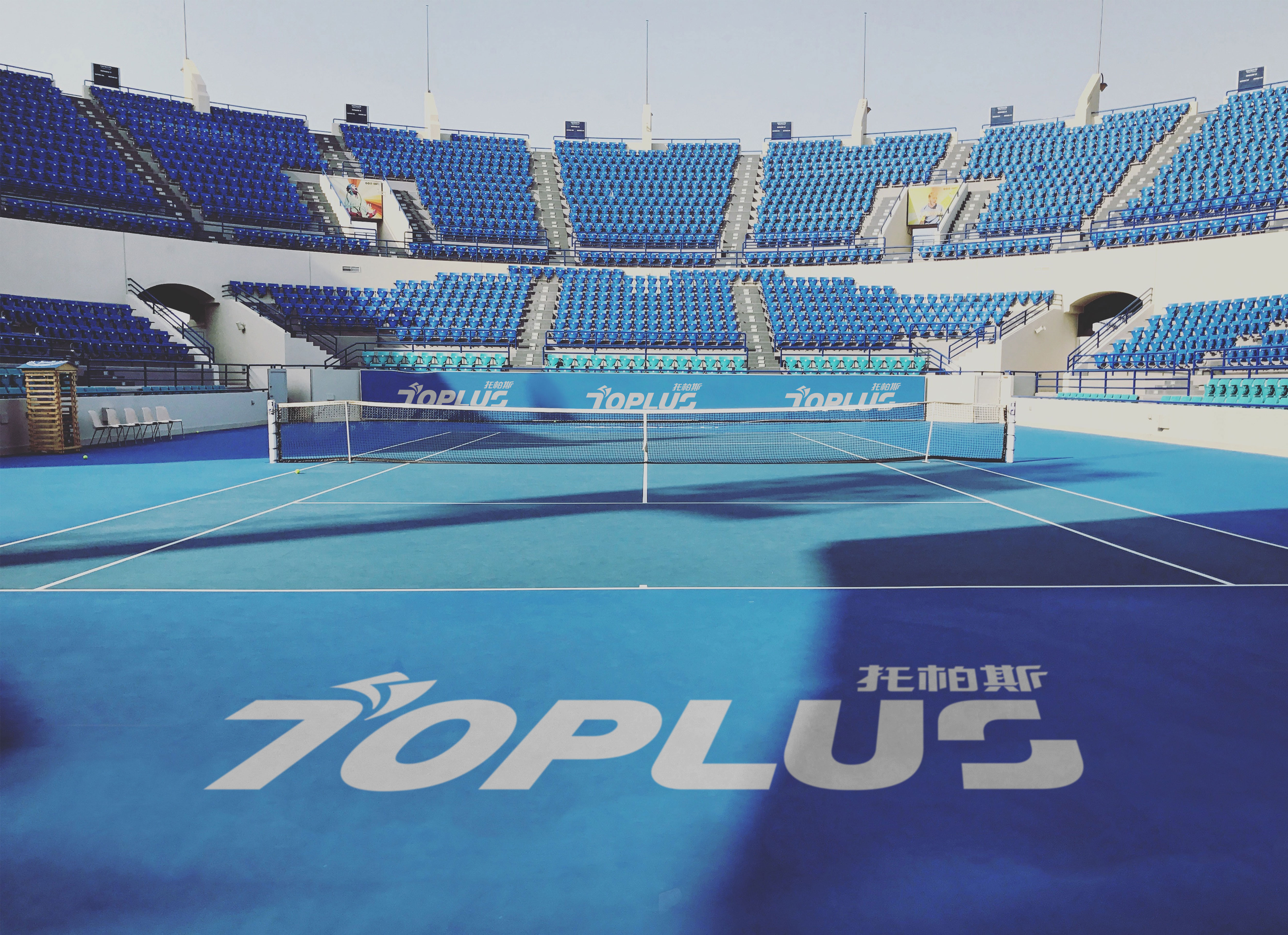
SAM BRANDESIGN has undertaken a brand image improvement for the Toplus surface system in Macau. The services provided include brand positioning and brand logo design. Toplus was established in 2002 and initially focused on surface experiences in Macau, such as tennis courts, basketball courts, children's playgrounds, and parking lots. Since then, they have expanded their presence to the Mainland China and Asian markets. The brand emphasizes the pleasure and comfort of leisure activities, developing products for different user groups and promoting the concept of enjoying sports and a safe and comfortable lifestyle. The brand logo incorporates the surface symbol by placing it in the visual focus of the English initial 'T'. The color scheme has been adjusted from the common eco-friendly green in the surface market to a blue color that conveys a sense of leisure and relaxation, complemented by touches of green and yellow to create a overall light-hearted and lively visual identity.
SAM BRANDESIGN為澳門的『托柏斯 - Toplus』面層系統進行品牌形象提升,服務內容包含品牌定位及品牌標誌。托柏斯 - Toplus成立於2002年,主要以澳門地區網球場、籃球場、兒童娛樂場、停車場等面層經驗,拓展到中國及亞洲市場。托柏斯 - Toplus強調生活休閒的愉悅好感,為不同的使用族群進行產品開發,建立享受運動及生活安全舒適概念。品牌標誌將面層符號帶到品牌英文字首『T』做視覺聚焦,顏色從面層市場常見的環保綠調整為具有生活休閒感的藍色系,以綠色及黃色點綴襯托主色,使整體呈現輕鬆且活潑的視覺識別。