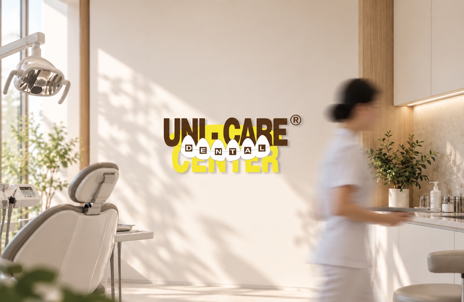
UNI-CARE Dental Center|仁康牙科醫療中心
Refine, rather than replace.
An established brand does not always need a new identity to feel renewed.
UNI-CARE Dental Center had already built recognition in Macau through its name, Chinese calligraphic identity, yellow and brown colour palette, and the brand line “Caring for Every Heart, Always” (「時刻關懷每顆心」). As its everyday materials needed to be updated, the opportunity was not to make the brand look completely new, but to reconsider how these familiar elements could appear with greater clarity and consistency.
Rather than replacing what people already recognised, SAM BRANDESIGN began with the brand touchpoints people encountered every day.
優化,而非取代。
一個已經建立認知的品牌,不一定每一次改變,都需要從重新設計開始。
仁康牙科醫療中心在澳門已累積一定的品牌認知,原有的名稱、中文書法字樣、黃與咖啡色,以及「時刻關懷每顆心」,都是品牌長期使用後形成的既有資產。當日常物料需要更新時,我們思考的並不是如何讓仁康看起來完全不同,而是如何在保留熟悉感的同時,讓這些品牌元素以更清晰、更一致的方式出現。
因此,這次合作沒有從全面改變品牌開始,而是先從人們日常接觸到的品牌接觸點著手。
Working with what already exists.
SAM BRANDESIGN retained UNI-CARE’s key existing brand assets and reconsidered how they could work together across different applications.
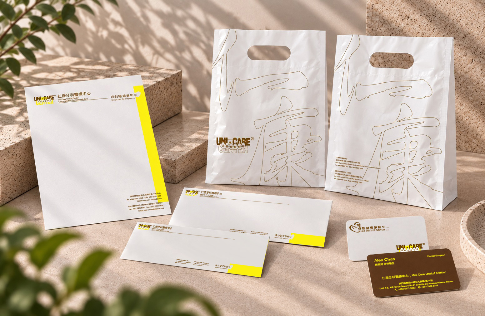
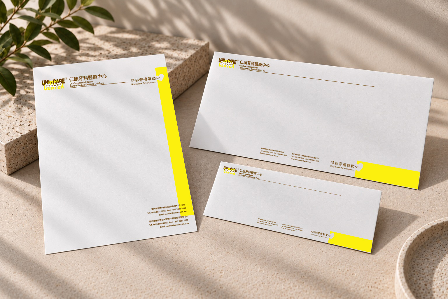
Rather than introducing an entirely new visual language, the existing yellow and brown palette was preserved while typography, information hierarchy, spacing and composition were refined. On the business card, professional, clinic and contact information were reorganised to make everyday communication clearer and easier to navigate.
The intention was not to create a different UNI-CARE, but to give familiar elements clearer roles and a more coherent way of working together.
從既有的品牌資產出發。
我們選擇保留仁康原有的重要品牌資產,重新思考這些元素在不同應用上如何彼此配合。
設計沒有刻意加入一套全新的視覺語言,而是延續既有的黃與咖啡色,並重新整理字體、資訊層級、留白與版面關係。在名片上,醫師、診所與聯絡資訊也被重新梳理,讓日常使用時的閱讀更加清晰。
我們想做的不是創造一個不同的仁康,而是讓人們已經熟悉的品牌元素,擁有更清楚的角色與更一致的使用方式。
Finding new possibilities within familiar assets.
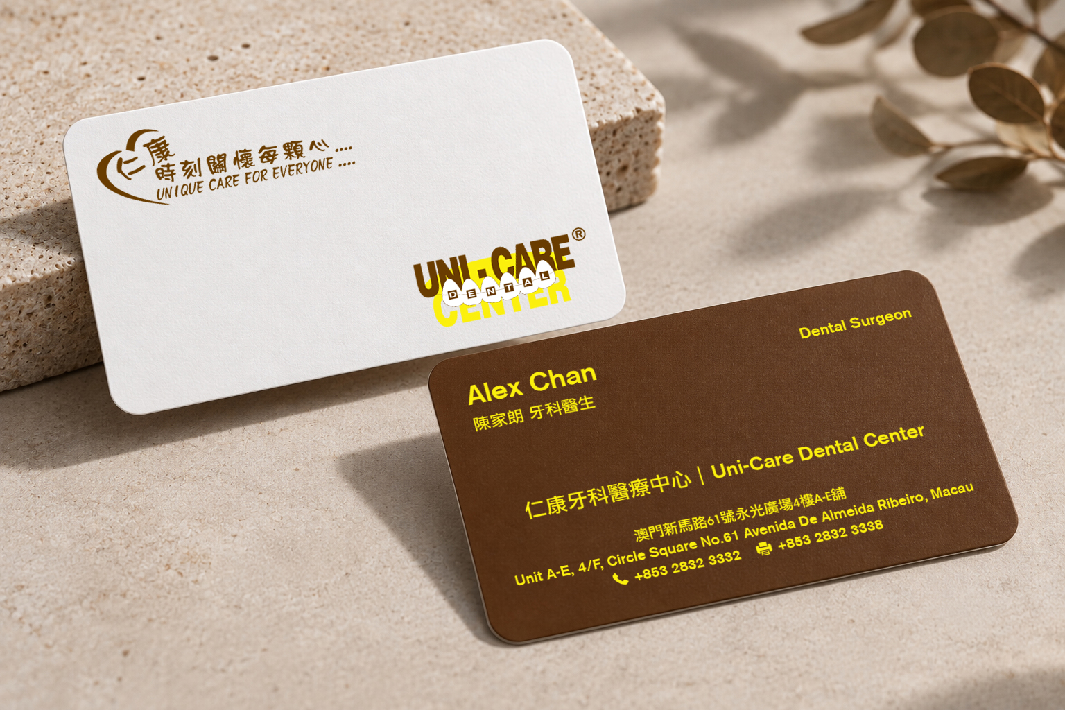
The same thinking continued across the stationery and carrier bag.
Within the stationery system, a yellow graphic element was developed in relation to the Chinese character for “heart” (「心」) in the existing brand line “Caring for Every Heart, Always” (「時刻關懷每顆心」). Colour therefore became more than decoration — it created a subtle connection between the brand’s visual identity and its existing language of care.
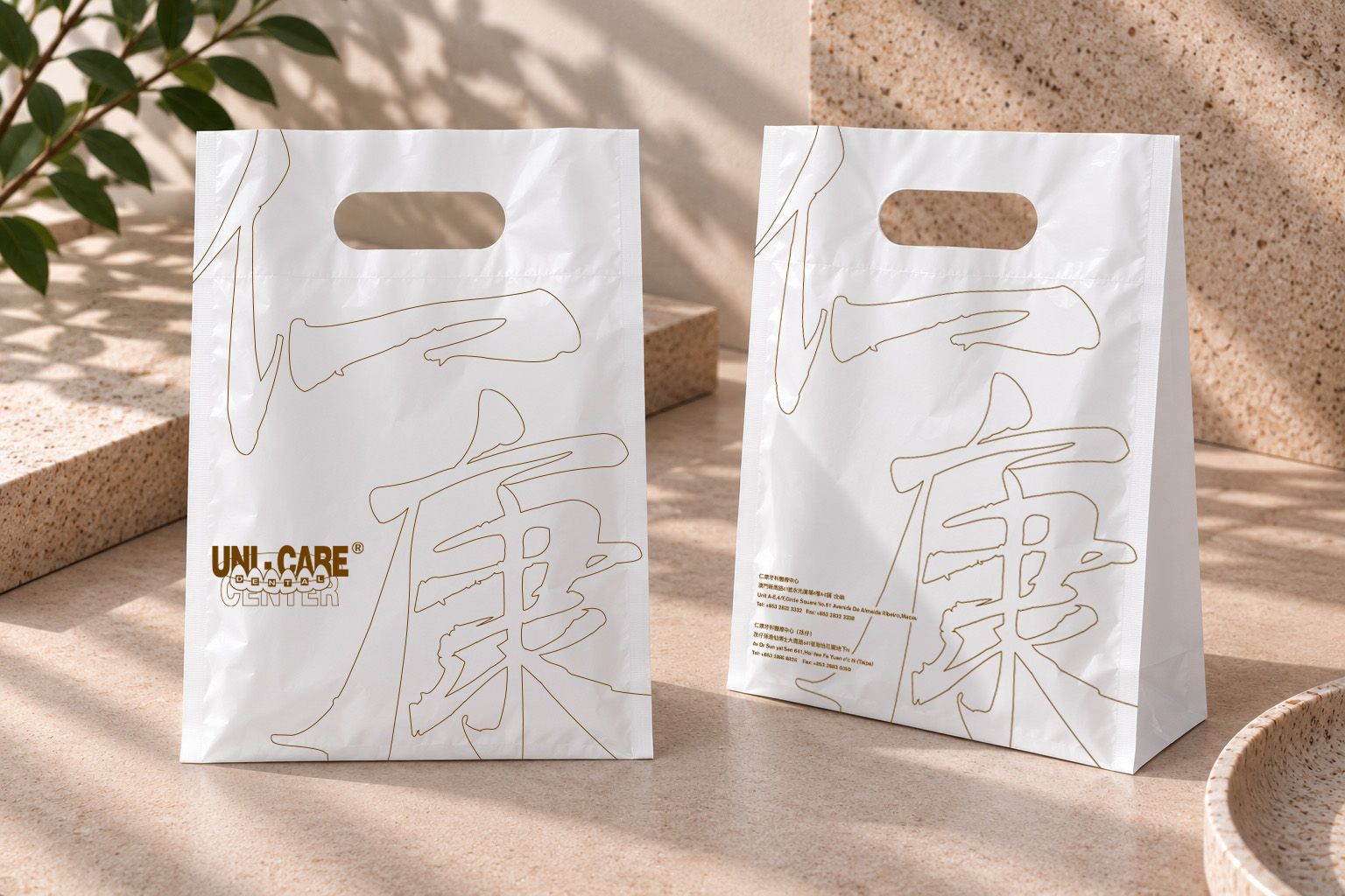
For the carrier bag, the familiar Chinese calligraphic form of the UNI-CARE name (「仁康」) was enlarged and cropped across the surface, allowing its strokes to interact with the edges and physical structure of the bag. Instead of creating another visual element, an existing brand asset was simply given a different role.
在熟悉的品牌資產中,找到新的可能。
同樣的思考,也延伸到文具與袋子的設計。
在文具系統中,我們讓黃色視覺元素與「時刻關懷每顆心」中的「心」產生連結。黃色因此不只是裝飾,而成為一個細微的視覺提示,讓既有的品牌色彩與「關懷」的語言建立更直接的關係。
在袋子的設計上,我們則將熟悉的「仁康」書法字樣放大、裁切,讓筆畫與袋子的邊界及實體結構產生關係。我們沒有另外創造新的視覺元素,而是讓原本就屬於品牌的資產,換一種方式被看見。
Familiarity can be an asset.
Brand evolution does not always begin with replacing what came before.
Sometimes, the more valuable step is to understand what already carries recognition, decide what deserves to remain, and find more intentional ways for those assets to work.
For UNI-CARE, the refresh began with everyday brand touchpoints — allowing the brand to feel renewed while remaining recognisably itself.
熟悉,本身也是一種品牌資產。
品牌的改變,不一定意味著取代過去。
有時候,更重要的是理解什麼已經形成認知、什麼值得留下,以及如何讓這些品牌資產以更有意識的方式繼續發揮作用。
對仁康而言,這次更新從日常的品牌接觸點開始。在保留原有辨識度的同時,也讓一個人們已經熟悉的品牌,以更清晰、更一致的方式繼續往前。