The Concept behind the Iconic FedEx Brand Logo Design
A brand logo serves as the visual representation of a company, carrying its values, mission, and image. In the business world, many well-known brands have logo designs with unique features, and among them, the FedEx brand logo design stands out. FedEx is a globally renowned courier and logistics company, and its brand logo design incorporates elements of creativity, simplicity, and profound meaning. This article explores the concept behind the FedEx brand logo design and analyzes the significance it holds.
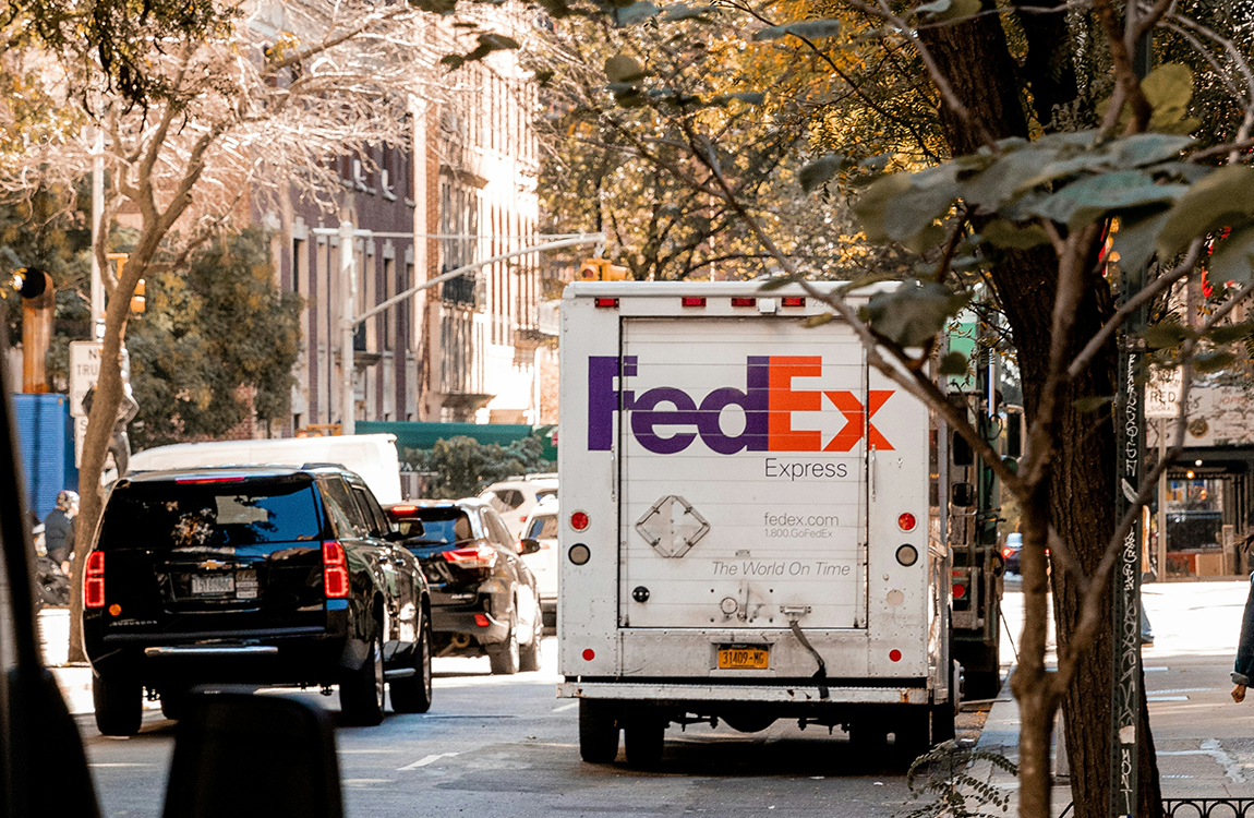
The FedEx brand logo consists of two parts: the wordmark and the graphic mark. The wordmark comprises the capital letters F and E, followed by lowercase letters d and x, forming a cohesive unit. There are no spaces between the letters, creating a seamless integration. Within the negative space between the letters, a cleverly hidden arrow graphic emerges, making it the most distinctive and unique aspect of the FedEx brand logo. This concealed arrow symbolizes the speed, accuracy, and efficiency associated with FedEx as a logistics company.
1. Speed and Efficiency
As a global logistics company, FedEx places great emphasis on speed and efficiency, which are among its core values. The hidden arrow graphic within the FedEx brand logo embodies these values. The arrow represents swift and seamless delivery, suggesting that FedEx promptly delivers customers' shipments to their intended destinations. This concealed arrow symbolizes not only speed and efficiency but also serves as a visual representation of FedEx's commitment to providing fast and reliable logistics services.
2. Accuracy and Reliability
FedEx enjoys a strong reputation in the logistics industry, with accuracy and reliability being crucial factors that attract customers. The arrow graphic within the FedEx brand logo can also be interpreted as a symbol of accuracy and reliability. The direction of the arrow is precise, unwavering, conveying FedEx's unwavering commitment to accuracy.
3. Creativity and Simplicity
The design of the FedEx brand logo exudes creativity and simplicity. The negative space between the letters is ingeniously incorporated into the design, forming a striking arrow graphic while maintaining overall coherence. This creative and simple design makes the FedEx brand logo visually captivating and also reflects the image of FedEx as a modern enterprise.
The concept behind the FedEx brand logo design integrates elements of speed, efficiency, accuracy, reliability, creativity, and simplicity. Through the cleverly hidden arrow graphic, it effectively conveys the core values and commitments of FedEx as a global logistics company. The arrow symbolizes speed, accuracy, and efficiency, representing FedEx's commitment to swiftly and accurately delivering customers' shipments. Furthermore, this arrow graphic also symbolizes the accuracy and reliability of FedEx, conveying steadfast commitment to customer satisfaction.
This creative and simple design not only makes the FedEx brand logo visually striking but also sets it apart. It has become a symbol of FedEx as a modern enterprise, conveying its leading position in the logistics industry and its dedication to customer care.
FedEx品牌標誌設計的理念
品牌標誌是一家公司的視覺代表,展現了它的價值觀、使命和形象。在商業界中,有很多知名品牌的標誌設計都有獨特的特點,其中FedEx的品牌標誌設計尤其引人注目。FedEx是一家全球知名的快遞和物流公司,它的品牌標誌設計結合了創意、簡潔和深意的元素。本文將探討FedEx品牌標誌設計的理念,並分析其所代表的意義。
FedEx的品牌標誌由兩部分組成:字母標誌和圖形標誌。字母標誌由大寫的F和E以及小寫的d和x組成,字母之間沒有間隔,形成一個整體。字母之間的空隙被巧妙地利用,形成一個隱藏的箭頭圖形,這是FedEx品牌標誌最獨特和引人注目的地方。這個隱藏的箭頭圖形代表了FedEx作為物流公司的速度、準確性和效率。
1. 速度和效率
FedEx作為一家全球物流公司,非常注重速度和效率,這是它的核心價值之一。FedEx品牌標誌中的隱藏箭頭圖形體現了這一價值觀。箭頭代表著快速、順暢的運送,暗示著FedEx能夠迅速將客戶的貨物送到目的地。這個隱藏的箭頭圖形不僅形象地展示了速度和效率,同時也象徵著FedEx對客戶的承諾,即提供快速可靠的物流服務。
2. 準確性和可靠性
FedEx在物流業界享有良好的聲譽,其準確性和可靠性是吸引客戶的重要因素。FedEx品牌標誌中的箭頭圖形也可以解讀為準確性和可靠性的象徵。箭頭的方向明確,傳達出FedEx對準確性的堅定承諾。
3. 創意和簡潔
FedEx品牌標誌的設計充滿了創意和簡潔。字母之間的空隙被巧妙地運用,形成令人驚嘆的箭頭圖形,同時保持整體的一致性。這種創意和簡潔的設計使得FedEx品牌標誌在視覺上非常引人注目,同時也展示了FedEx作為一家現代企業的形象。
FedEx品牌標誌設計的理念融合了速度、效率、準確性、可靠性、創意和簡潔的元素。通過隱藏的箭頭圖形,它有效地傳達了FedEx作為全球物流公司的核心價值觀和承諾。箭頭象徵著速度、準確性和效率,代表著FedEx快速而準確地將客戶的貨物送達目的地的承諾。此外,這個箭頭圖形還象徵著FedEx的準確性和可靠性,傳達出對客戶滿意度的堅定承諾。
這種創意而簡潔的設計不僅使FedEx品牌標誌在視覺上引人注目,也使其與眾不同。它已成為FedEx作為現代企業的象徵,展示了其在物流行業中的領先地位和對客戶關懷的奉獻精神。
